Integrating Predictor Types: Categorical and Continuous
Information is only useful when it can be understood.
- Muriel Cooper
Difference is easy to see and hard to define. A great deal of energy in experimentation is spent on locating the source of the difference between two things. Sources of difference are where information hides, and many tools have been developed to tap into that information– chief among those: the linear model. The linear model, simple enough, seeks to explain the differences in a set of observations as a linear combination of the sources of difference, or predictors, that affect them.
Information hides itself in various ways though, and sometimes it’s hard to see a linear model for what it is. Two tools that test for the significance of predictors in a linear model, Analysis of Variance (ANOVA) and Linear Regression, can seem at first to be completely different things. I wanted to take a moment to clarify that both techniques rely on the same underlying structure.
The difference between ANOVA and regression concerns the sources of difference that they test. ANOVA tests the significance of categorical predictor variables, data for which regular arithmetic is impossible. Categorical data includes things like colors, classes, and types; it’s an umbrella term that covers all kinds of abstract groupings of observations. Regression tests the significance of continuous data, anything with meaning that can be represented on a number line. Observations of some variable of interest can be affected by both types of predictor variables, and so here, in the first of a what will be a series of posts about generalized linear models, I’ll try to visualize my intuition behind seeing both as equals in the linear model.
The Data
I’ll be using the ToothGrowth dataset to start as an example. Its documentation states:
The response is the length of odontoblasts (cells responsible for tooth growth) in 60 guinea pigs. Each animal received one of three dose levels of vitamin C (0.5, 1, and 2 mg/day) by one of two delivery methods, orange juice or ascorbic acid (a form of vitamin C and coded as VC). C. I. Bliss (1952). The Statistics of Bioassay. Academic Press.
I think this is a good start because both variables can be coded as either categorical and continuous for the sake of example. Recoding dosage from a numeric into a factor should seem simple enough, and recoding supplement from a factor into a numeric can be analogized as recoding from the name of the supplement (‘orange juice’ and ‘vitamin C’) to something like its vitamin C concentration (arbitrarily, 0.5 and 1.0).
Let’s take a peek at the data:
| D0.5 | D1 | D2 | |
|---|---|---|---|
| OJ | 13.23 | 22.70 | 26.06 |
| VC | 7.98 | 16.77 | 26.14 |
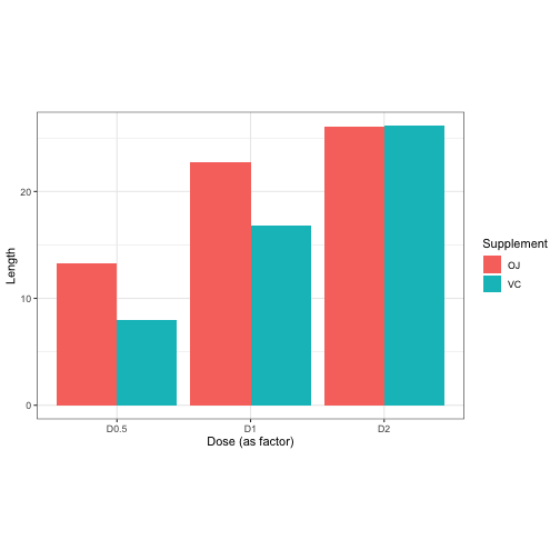
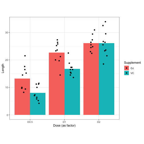
Each cell in this table is a bucket where 10 Length observations have been averaged. The goal is ultimately to develop a model that describes Length in terms of information hidden in the Supplement and Dosage variables. In this data, there are only six unique conditions for the 60 observations to fit within. That means best model we can create will give us, at most, six different possible estimates for any Length we try to predict. Let’s try to visualize this.
Informative Visualizations
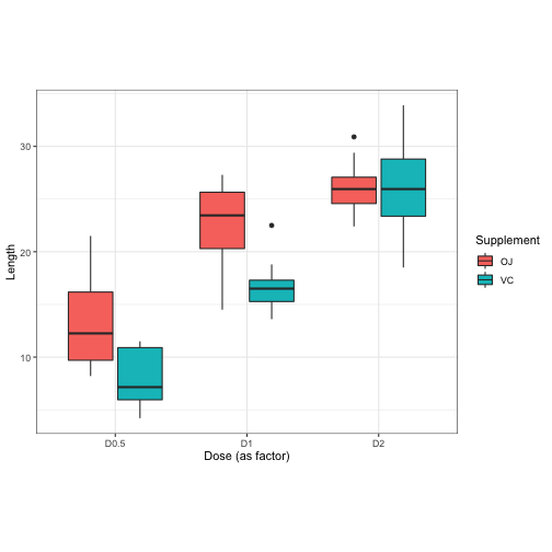
The most informative was to display data like this is a boxplot. It shows you the median of the six conditions, as well as information about how observations in each condition are distributed.
But for today I’m going to prefer barplots like this one. These only display the mean value of each estimable condition, but that’s useful for us because we want to visualize what kind of things we can estimate based on the information we give to a linear model.
This leads us into another kind of visualization…
Intuitive Visualizations
Yes, intuitive is not the same as informative. I want to make this clear now because an intuition, like a model, is a simple way to understand something that isn’t perfectly correct. I use spatial intuition a lot and so I really like 3d plots and graphs, but they aren’t usefully informative! 3d plots can obscure themselves because at the end of the day they’re being shown to you on a flat screen. Nevertheless, since you can click, drag, and scroll to explore the 3d plots I want to show you, I think they’re useful to help draw the link between regression and ANOVA that I want to make clear.
Height, Heatmaps, and Tables
The reason I want to use 3d bar charts specifically is because when you click-and-drag to look at the bars from above, it’s like looking at a data table from before (without marginal means) and having the data climb out from the screen to you. With three dimensions, we can spatially discriminate between Supplement conditions. I think we can reuse color to be more meaningful, so how about we color the bars based on their height.
Now, when viewed from above, this bar chart resembles a heatmap of the data table. Here’s a heatmap of the data for reference:
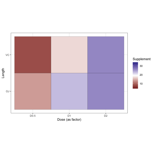
And the original table:
| D0.5 | D1 | D2 | |
|---|---|---|---|
| OJ | 13.23 | 22.70 | 26.06 |
| VC | 7.98 | 16.77 | 26.14 |
Boxes, Bars, Scatters, and Surfaces
So I already mentioned that the best way to display data like this is a box plot. Why? Because it gave the most real information about the data. The only way we could get more information is by just looking at each observation individually… which we can do. It doesn’t add much to the box plot, but let’s overlay the raw values of the observations onto it for a second.
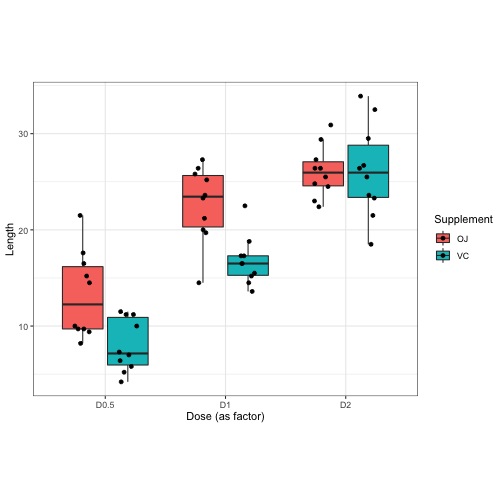
Would it add more to a barplot if we did the same for it? Let’s see…
Well this looks disppointing so far, but let’s just once again try to translate this into three dimensions because then something should become clear. Be sure to click and drag to rotate the plot around to explore.
Do you see now how this bar chart underlays a scatterplot? We’ve moved from a box plot, the paramount representation of categorical data, to a scatterplot, the most basic representation of continuous data! In fact, I can even draw a regression plane to fit it, and that plane not only approximates the data points, but also the tops of the heatmapped bars from earlier!
To Be Continued…
I’d like to take a break for now, but I’m getting some animations ready so that next time I can explain how the slopes of the regression plane relate to the beta coefficients for factor levels, how its curvature is related to an interaction effect, and where the terms nominal and ordinal come into this all. I hope to continue generalizing visualizations across different linear model-based techniques until I build up to a full explanation of general linear models and its matrix instantiation.
Thank you,
Blake
Special Thanks
I finally learned how to embed interactive rgl plots!! This was all thanks to this post by Gervasio Marchand on his blog.
I also want to thank Christopher Wardell for barplot3d, the package I used (slightly modified) to create the 3d barplots.