Recognize that every interaction you have is an opportunity to make a positive impact on
others[your model].
- Shep Hyken
Hello! I decided that today I’d quickly draw up some figures to visualize my intution behind main and interaction effects in factorial designs and how it can help to properly represent ANOVA as a linear model mentally.
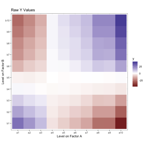
Let’s start by generating some data based on a score model. I’ll have 1000 data points with a grand mean of 0. The observations are divded into two crossed factors, A and B, each with three levels. The data can then be modeled as below: an observations y is the sum of the grand mean of the data, the main effect of the ith level of A, the main effect of the jth level of B, the interactions effect between the two levels, and an error term for the kth observation in that factor condition.
y = mu + eff_a[i] + eff_b[j] + eff_ab[i, j] + err[i, j, k]
n <- 100
mu <- 0
err <- rnorm(9 * n, sd = 0.1)
err <- err - mean(err)
A <- c('a1', 'a2', 'a3') %>% rep(each = 3) %>% rep(n)
B <- c('b1', 'b2', 'b3') %>% rep(3) %>% rep(n)
a_eff <- c('a1' = -2, 'a2' = -1, 'a3' = 3)
b_eff <- c('b1' = -1.5, 'b2' = 0, 'b3' = 1.5)
ab_eff <- c('a1b1' = 0, 'a1b2' = 0, 'a1b3' = 0,
'a2b1' = 1, 'a2b2' = -1, 'a2b3' = 0,
'a3b1' = -1, 'a3b2' = 1, 'a3b3' = 0)
y_aa <- map_dbl(A, function(x) a_eff[[x]])
y_bb <- map_dbl(B, function(x) b_eff[[x]])
y_ab <- paste(A, B, sep = '') %>% map_dbl(function(x) ab_eff[[x]])
y <- mu + y_aa + y_bb + y_ab + err
data <- tibble(A, B, y, y_aa, y_bb, y_ab, err) %>%
mutate(A = as_factor(A), B = as_factor(B))
Here’s what our data looks like:
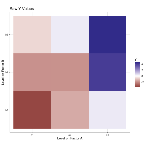
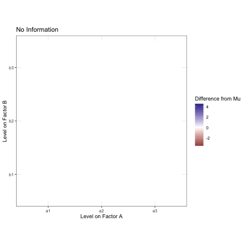
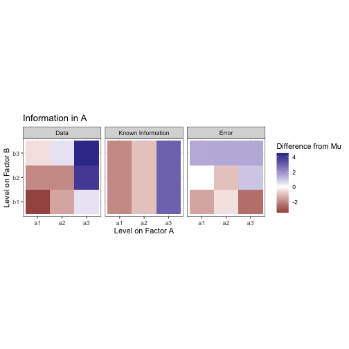
We want to decompose this into meaningful factors. Pretend for a moment you didn’t just see the model I generated this data from. Let’s start by assuming that, without any information about factor conditions, every observation is equal to mu, the grand mean.
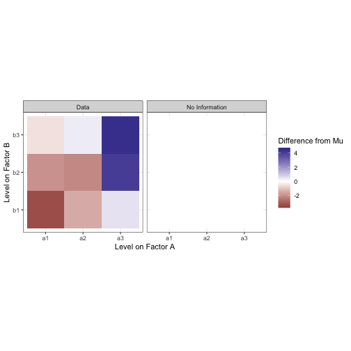
All the data are the same. We know nothing to differentiate them. To differentiate data by condition, there would need to be some sort of contrast between the levels. Let’s start by trying to draw a constrast between the levels on factor A. Assuming we know which level from A each observation was taken from, we can now compute the mean of all the values in each of the levels a1, a2, and a3. This is the marginal mean. The same can be done in the other direction to extract the marginal mean for B.
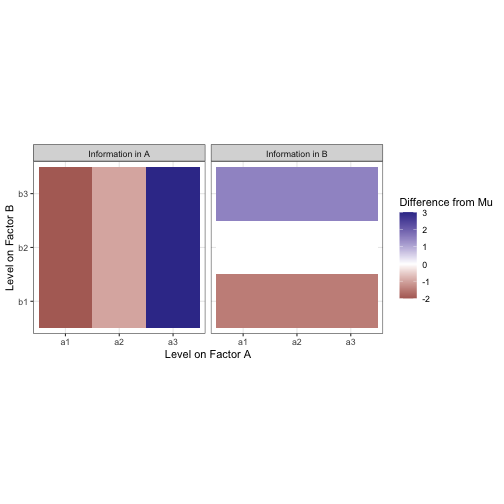
These marginal means are analogous to the effect of each level of the factors. Note that the effects of both A and B sum to zero. The additional information about factor condition doesn’t change what we know already about the data (the mean), it only creates a difference within it. The mean for all of this data is still mu, we are only drawing constrast between subsets of the whole.
Now we can overlay the marginal mean heatmaps from A and B over each other to show what our estimate should be if we used a model like y ~ A + B.
Not bad! But there’s still some difference between our moodel and the data. We need to account for an interaction effect between factors A and B in order to explain more of the variance from the mean in this data.
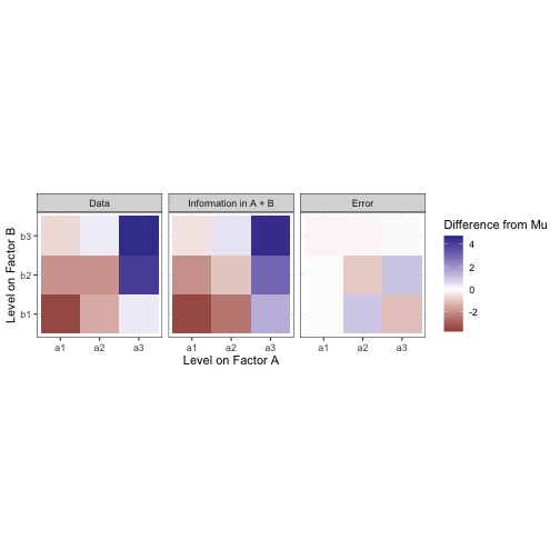
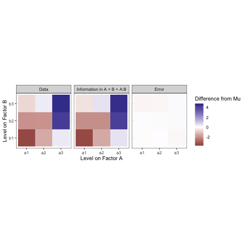
If the main effects of A and B are visualized as above, you will notice that they have distinct stripes or directions. This is because the data matrix estimated by a model like y ~ A or y ~ B will really just be a stack of copies of the marginal mean vector (i.e. a matrix with rank of one). To fully model the data matrix, you need another screen that can only be described as a whole matrix rather than one vector. That is the interaction effect, under the constraint that all marginal means in the interaction equal zero. Including an interaction gives us this:
Here’s an animation of the successive screening of a model a you add in terms to explain more and more of the data:
I think now is a good time to try to link this in with linear regression. I purposely sorted the levels of factors A and B by their effects, and think that with more levels we can link this data to a continuous model mentally.
Perhaps now this table looks strangely like a continuous model. Let’s try to actually use height to show these values with rgl.
If we try to model this data with a formula like y ~ A + B (i.e. without an interaction term) we can only fit this data to a plane. The data exists in three dimensions but the fitted model can only span two of them:
The interaction effect basically serves to cover for a principal weakness in the model of the data we’re building. The contrasts between the levels of A and the levels of B are are unidimensional. When you add those effects together (as in “Main Effects of A and B” form earlier) you can at most have a model with the same rank as the number of factors you have, and fail to fill your output space and properly fit your data. The interaction term is what fills the rest. Here is a model fit to the data with the formula y ~ A + B + A:B (or, equivalently y ~ A * B):
At least, that’s how I imagine it.
Anyway, thanks for reading!
Blake