Let’s take a not-so-grand tour of a PCA
We’re just
PCHPCA cruising…
- Jaden Smith
I was recently inspired by the this post in Distill that introduced me to the Grand Tour, a linear method for communicating high-dimensional data with animation. It projects high dimensional data down onto (ultimately) every possible 2-dimensional subspace for viewing in a smoothly transitioning sequence. It’s like rotating the structure around to see it from every angle. A static linear dimensionality reduction method would only show you the angle that contained the most information (in other words, explained the most variance in the data). I thought it could make for some interesting visualizations of certain structures and set my sights on implementing it, or some simple version of it.
I decided that the best way to experiment with this would be to visualize data with uncorrelated variables, because working with orthogonal bases would allow me to take shortcuts in the animation process. For this, I decided to do a principal component analysis (PCA) using the library FactoMineR to re-express a dataset in orthogonal components.
Principal Component Analysis with FactoMineR
This is actually my first time using FactoMineR so I decided to use the dataset that’s used in the FactoMineR PCA example page on their website, the decathlon dataset. I’ll walk you through that now:
library(tidyverse)
library(FactoMineR)

# Load in the dataset from FactoMineR
data(decathlon)

# Conduct PCA on continuous columns
res_pca <- PCA(decathlon[, 1:12])
| Scatter | Loadings |
|---|---|
 |
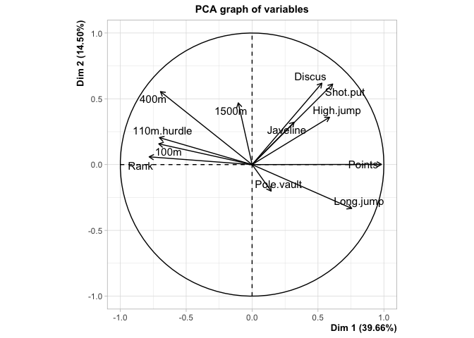 |
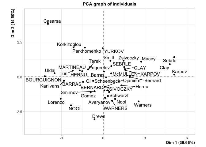
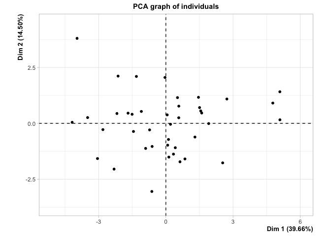
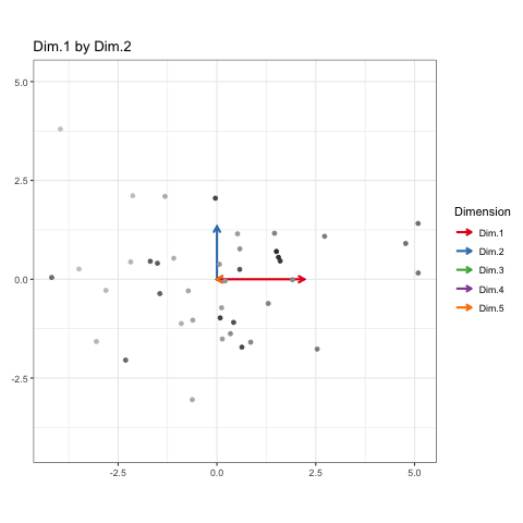
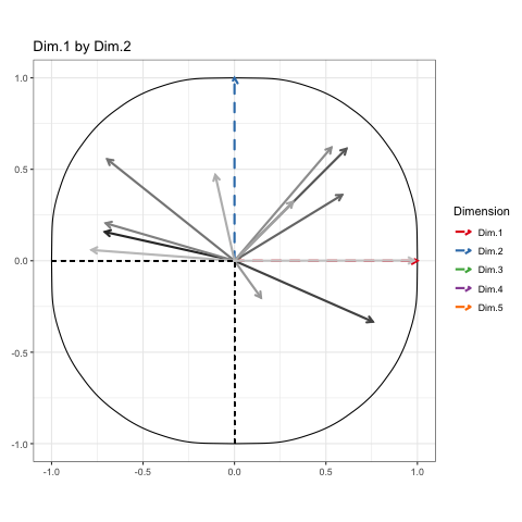
This is how the results of a PCA are usually presented. First, we see the observations projected into space spanned by their first two principal components, or dimensions. These dimensions are ranked based on what portion of the total variance in the oberservations they can explain (i.e. 39.66% of the variance in the athletes scores is contained in the scores on Dimension 1). Next, we see the circle of correlations made by plotting the correlation of each native variable with the datas principal components. This gives meaning to the dimensions in the first plot, by showing how the native variables constitute the new bases (i.e. High Jump and Long Jump are positively correlated with Dim.1, but Rank isn’t).
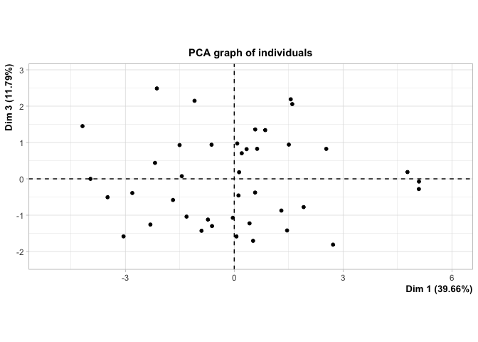
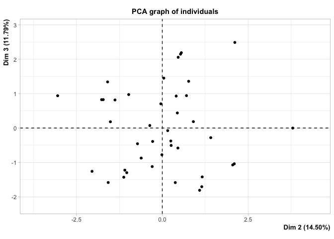
How unfortunate that we can only see the first two dimensions here! What if there were some untold wealth of information hiding just beyond our reach, in Dimension 3 or 4? Well, we could call it up like this:
plot.PCA(res_pca, axes = c(3, 4))
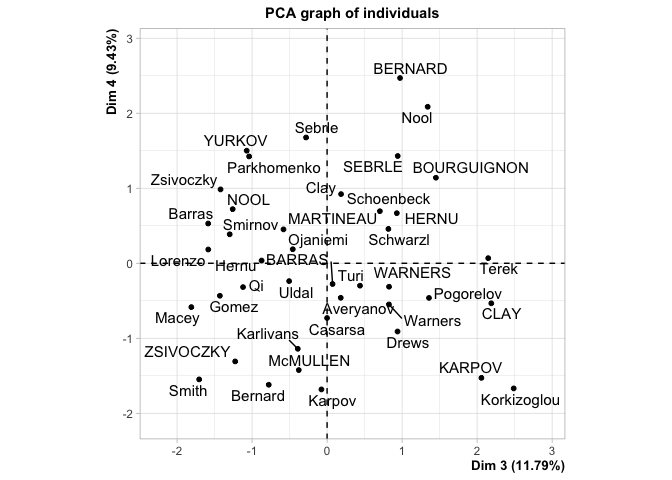
But look how much screen space we’ve wasted! It’s the digital age and I want to cram this into the same plot as the first two dimensions on a flat screen. Now you might say “Well, Blake! Why don’t you just look at a scree plot! It’ll show you the relative amount of information between dimensions and then you can decide whether or not you really need to show all of this information!” I certainly could, like this:
library(ggplot2)
scree_dat <- res_pca$eig %>%
  as_tibble(rownames = 'component') %>%
  mutate(component = as_factor(component))
ggplot(scree_dat, aes(x = component, y = `percentage of variance`, group = 1)) +
  geom_line() +
  geom_point() +
  theme_bw()
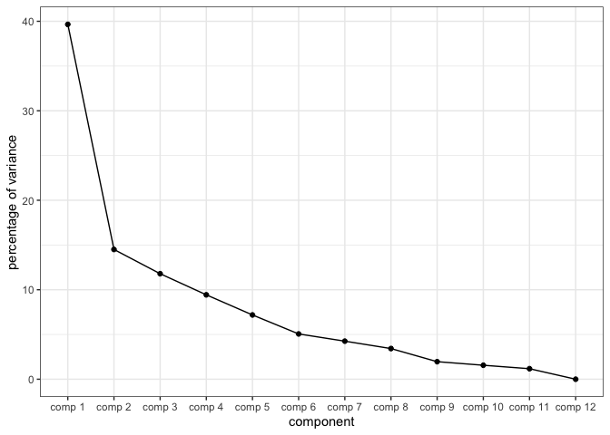
And this would show me quite clearly that Dimensions 1 and 2 contain ample information to present this data with, and I could avoid this problem completely. But then I wouldn’t have an excuse to learn gganimate, so we’re going to show off all of these dimensions anyway.
Plotting a PCA Cruise
To show every bit of information possible about the data, we’ll be doing a Grand Tour-esque traversal of the data after being projected (realigned is probably a better word) into the component space. Instead of a tour, I’ve decided to call it a PCA cruise because it sounds awfully close to the chorus of that one Jaden Smith song. We’ll show pairs of dimensions sequentially, like this:
# First, we'll plot dimensions 1 and 2
plot.PCA(res_pca, label = 'none', axes = c(1, 2))
# Then, we'll rotate dimension 2 outward and bring in dimension 3
plot.PCA(res_pca, label = 'none', axes = c(1, 3))
# Then, we'll rotate dimension 2 back in to replace dimension 1
plot.PCA(res_pca, label = 'none', axes = c(2, 3))
| Dim.1 by Dim.2 | Dim.1 by Dim.3 | Dim.2 by Dim.3 |
|---|---|---|
 |
 |
 |
These will constitute the key frames of the animated plot. This pattern can follow until we’ve seen every dimension plotted. All we need is a properly formatted dataframe to do it.
Building a tidy dataframe
I’m a fan of tidyverse and its syntax. ggplot and gganimate, which I’ll be using for this, seem to work best with the tidy syntax and so I’ll need to conform to it to get this done as smoothly as possible. The tidy syntax has three conditions for dataframes:
- Each variable must have its own column.
- Each observation must have its own row.
- Each value must have its own cell.
To do this for each key frame I’ll need to introduce a bit of redundancy. First, I’ll grab the projected coordinates from res_pca and make a matrix showing the dimension configurations I intend to cycle through:
scatter <- res_pca$ind$coord
scatter[1:5, ]
>               Dim.1      Dim.2      Dim.3      Dim.4       Dim.5
> SEBRLE   1.50509908  0.7038928  0.9418516  1.4300073  0.57877082
> CLAY     1.55741711  0.5554568  2.1891163 -0.5335835 -0.78038352
> KARPOV   1.59996822  0.4625653  2.0569580 -1.5276391  1.57216651
> BERNARD  0.08242073 -0.9779441  0.9724700  2.4695691  0.08487193
> YURKOV  -0.03923536  2.0507210 -1.0717485  1.5007847  1.41509091
pairs_idx <- matrix(c(rep(1:ncol(scatter), each = 2),
                      rep(1:ncol(scatter), each = 2)[-(0:3)],
                      rep(1:ncol(scatter), each = 2)[0:3]),
                    nrow = 2,
                    byrow = TRUE)
pairs_idx
>      [,1] [,2] [,3] [,4] [,5] [,6] [,7] [,8] [,9] [,10]
> [1,]    1    1    2    2    3    3    4    4    5     5
> [2,]    2    3    3    4    4    5    5    1    1     2
pairs <- pairs_idx %>%
  apply(2, function(x){ return(colnames(scatter)[x]) })
pairs
>      [,1]    [,2]    [,3]    [,4]    [,5]    [,6]    [,7]    [,8]    [,9]    [,10]
> [1,] "Dim.1" "Dim.1" "Dim.2" "Dim.2" "Dim.3" "Dim.3" "Dim.4" "Dim.4" "Dim.5" "Dim.5"
> [2,] "Dim.2" "Dim.3" "Dim.3" "Dim.4" "Dim.4" "Dim.5" "Dim.5" "Dim.1" "Dim.1" "Dim.2"
Each of these configurations is like one “state” of the animation (or “key frame” as I phrased it earlier). I’ll recycle this matrix so that every observation and each dimension can appear once in each state.
labs <- pairs %>%
  t() %>%
  rep(each=nrow(scatter) + ncol(scatter)) %>%
  matrix(ncol = 2)
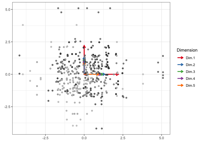
Now I need to get the x and y coordinates for each observation at each state. I make the dimension basis vectors to their direction in that state and then scale the to the standard deviation of the data on that dimension. I also make vectors to make clear whether these coordinates belong to an observation point or a dimension arrow and attach names to them.
coords_x <- c()
coords_y <- c()
for (col in 1:ncol(pairs)){
  labs_tmp <- pairs[, col]
  tmp <- scatter[, labs_tmp]

  z <- rep(0, ncol(scatter))
  z[pairs_idx[1, col]] <- sd(tmp[, 1])
  coords_x <- c(coords_x, tmp[, 1], z)

  z <- rep(0, ncol(scatter))
  z[pairs_idx[2, col]] <- sd(tmp[, 2])
  coords_y <- c(coords_y, tmp[, 2], z)
}

typs <- rep(c(rep('ind', nrow(scatter)), rep('var', ncol(scatter))), ncol(pairs))
nms <- as_factor(rep(c(rownames(scatter), colnames(scatter)), ncol(pairs)))
And then I squish them all into a now-tidy dataframe!
df_anim <- tibble(h = labs[, 1],
                  v = labs[, 2],
                  x = coords_x,
                  y = coords_y,
                  t = typs,
                  n = nms) %>%
  mutate(s = as_factor(paste(h, v, sep = ' by ')))
Using gganimate
Now is the moment of truth. To make this animation work, I first need to show that I can cram everything into a ggplot figure. If I can, then I can divide which geoms show up when based on the value in their state, s, variable and gganimate will take care of the rest.
library(ggnewscale)

p <- ggplot(df_anim, aes(x = x, y = y)) +
  geom_segment(x = 0, y = 0, aes(xend = x, yend = y, color = n),
               data = filter(df_anim, t == 'var'),
               size = 1,
               lineend = 'round',
               linejoin = 'mitre',
               arrow = arrow(length = unit(0.2, 'cm'))) +
  scale_color_brewer(name = 'Dimension', palette = 'Set1') +
  new_scale_color() +
  geom_point(aes(color = n),
             data = filter(df_anim, t == 'ind'),
             show.legend = FALSE) +
  scale_color_grey(name = 'name_ind') +
  labs(x = element_blank(),
       y = element_blank()) +
  theme_bw()
p
Awesome! Now to ask gganimate to separate it up by state, maybe even tell us what state we’re in in the title bar, and then render the whole thing as an easily embeddable .gif!
library(gganimate)

anim <- p +
  transition_states(s,
                    transition_length = 5,
                    state_length = 2) +
  ease_aes('circular-in-out') +
  ggtitle('{closest_state}')
animate(anim, nframes = 300, fps = 30, renderer = gifski_renderer())
And there you go! A naive version of the grand tour to sequentially observe orthogonal view angles of high-dimensional data. All of the frames in between states aren’t actual projections of the data, but I figured the use-value of this kind of animation to me didn’t justify the time it would take to really work it all out. But it does look neat!
A similar process can be used to animate the circle of correlations too:
The tidy toll on memory
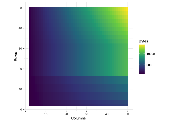
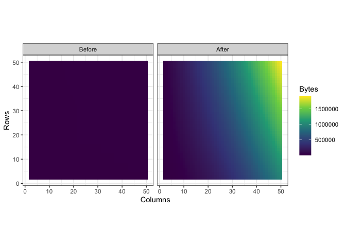
Storing the data in the way that I did introduced a lot of redundancy, as I mentioned before. To see exactly what the impact on memory was, I wrote a function to call pryr:object_size() on a tibble with a certain number of rows and columns. Then I subjected that tibble to th same process I used to convert df into df_anim previously and called pryr::object_size() again. Here’s a side by side of the memory load from df and df_anim, each with their own color scale:
| Before | After |
|---|---|
 |
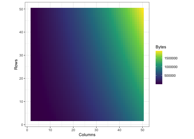 |
You can see what looks like artifacts in the first plot, of the memory load of df before being converted, because of some small scale memory saving techniques in the structure of tibbles. The reason I’ve separated their color scales is because together, the size difference is nearly incomparable:
ggplot(mem_load, aes(x = Columns, y = Rows, fill = Bytes)) +
  geom_tile() +
  scale_fill_viridis_c() +
  facet_wrap(~ Class)
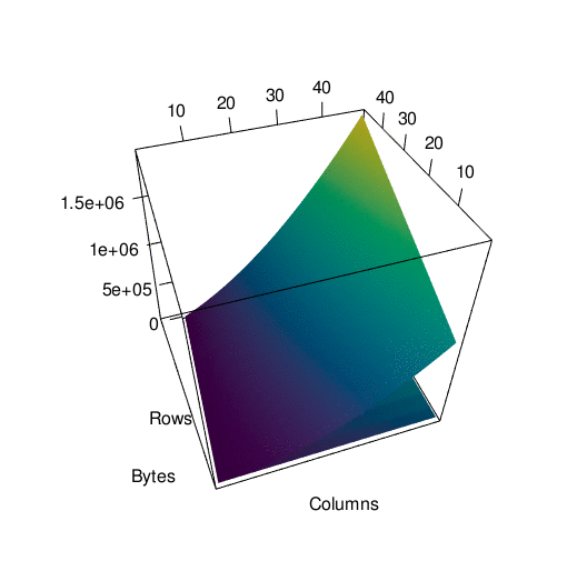
To get a better picture of the difference, here is the same data plotted in 3d. It’s spinning a little fast so here’s an interactive version of the plot if you want to look around at your own pace.
In any case…
Though the animated plot is fun to watch, I don’t think that animating PCA results with this Grand Tour-inspired method really gives you much more than style points. If you really want to be able to show all the results of a PCA without wasting all your screen space, try something like Factoshiny. But, I had fun and learned the basics of gganimate (and learned how hard it is to embed and rgl widget into a jekyll page). Like last time, I’ve uploaded the basic code for this as a gist if you want to use or improve it:
Thanks,
Blake